User Guide
Getting started
Here you'll find a brief overview of the primary app features, how to use them, how to get the most benefit from them, and a simplified explanation of how they work.
Overview
When you register for the app, you'll first be asked to authenticate with Zwift. This is required and not optional. Zwift is clear that accessing zwiftpower.com requires the user to have a Zwift account. Since we are using data from zwiftpower.com, it only makes sense that we enforce the same standards. In other words, if you can't access zwiftpower.com, then you can't access this site either.
After registering and successfully authenticating, you'll be redirected to your profile page. At this point, an onboarding import job will start. This job pulls in your race results, your Zwift friends and followers and their race results. If you're on a team, it'll also import your teammates and their race results.
Next, we run an algorithm that selects the best candidate events to establish the most accurate performance trend baseline possible, consisting of the metrics that we think matter the most to Zwift racing success. You'll see a progress report during this import. Depending on your race history, it could take some time to complete, which is why this job runs as a background process. All that means is you are free to leave the page without fear of losing progress. When the job finishes, the page will automatically reload. Now that your baseline is established, it's time to start exploring!
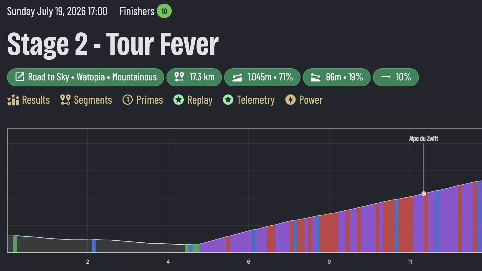
Click on Events in the menu bar to go to the events page. The default view shows today's upcoming events. Click on an upcoming event to see signups and event details like the route, route profile chart, percentage of the route that is uphill, downhill and flat.
Change the filter to past events. Clicking on an event in the table will take you to the live event page if the event is ongoing, or, if it is finished, you'll be taken to the results page. No need to navigate between signups, results, and live event pages for the same event. Our navigation is set up to take you where you want to go automatically.
Race replay
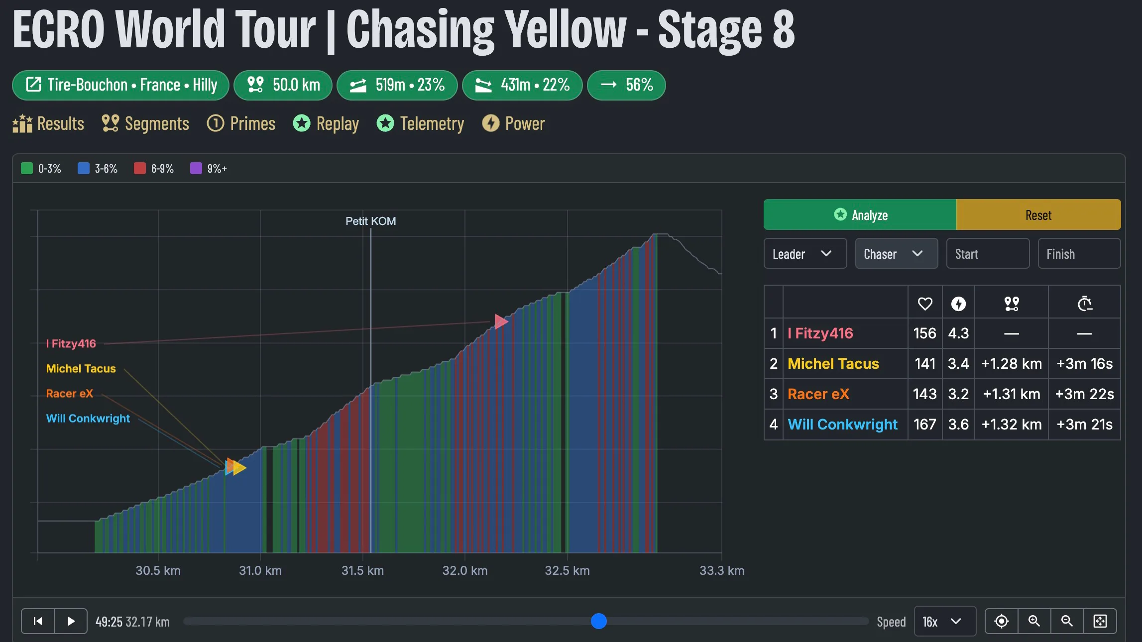
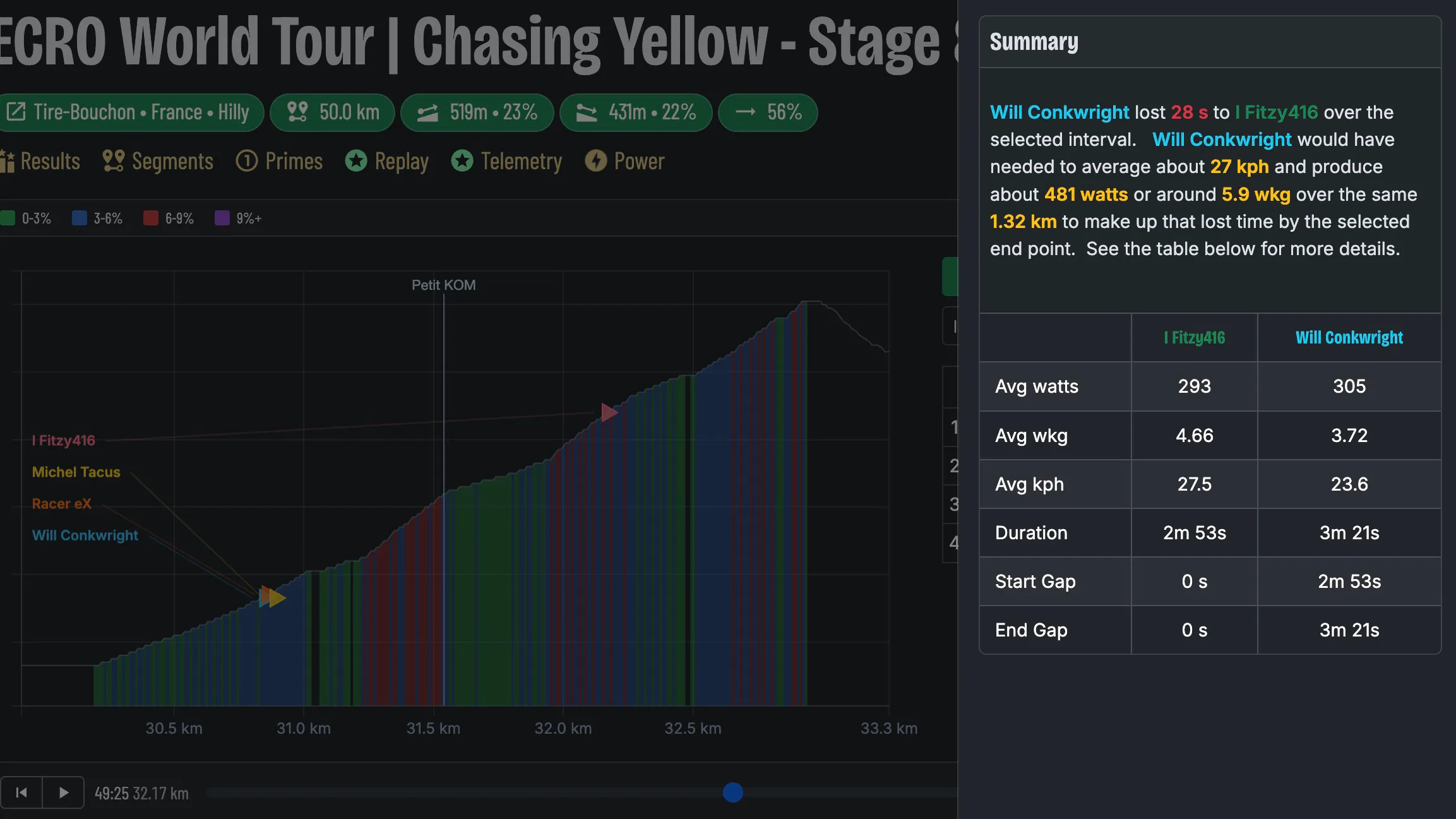
Quite possibly my favorite feature so far. 😊 This chart is designed to let the racer focus in on a specific part of a race and replay how it went down frame by frame. The key question the analysis summary answers is, "How hard would I have needed to go to make up the time that I lost?" With that result, the racer can then more confidently answer, "Could I have closed the gap?"
That was the question I had after getting dropped and not being able to bridge back to the leaders. How much power would I have needed? Could I have done it? Was I feeling weak or were they feeling strong? Running this analysis after races has really helped me calibrate my own "close the gap" model.
Of course, past performance is not indicative of future results, but studying past performance definitely helps you understand what it takes to chase down the lead group.
How to use it
- Open the event you want to analyze.
- Select riders from the chart that you want to compare.
- Use the replay controls to play, pause, or move to a specific point in the event. The live replay table to the right of the chart will show the charted riders' power, heart rate, time, and distance gaps as they were at that point in the event.
- Once you find the point you want to analyze, select the leader and chaser from the filters. Their respective locations on the chart are added to the start and finish inputs automatically.
- Click analyze, and a sidebar will open up with the results.
Limitations
The current gap analysis model only accounts for scenarios where the chaser was slower than the leader over the chosen segment. This has been sufficient for most of the scenarios I have encountered so far, but as of this writing (07-19-26), it doesn't account for a situation where the chaser is faster than the leader over the chosen segment.
This scenario can happen if you are dropped and are closing the gap but don't close it before the end of a race. In this situation, it would be helpful to know how much more effort would have been needed to close the gap, but the current model doesn't account for that scenario.
Another limitation is the availability of data. This feature uses the race report from zwiftpower (aka telemetry aka the .fit file). Some racers can opt out of sharing this data and it also can take quite a while for Zwift to process the .fit files after a big event. So just because race results are available doesn't mean telemetry is available.
F1-style telemetry traces
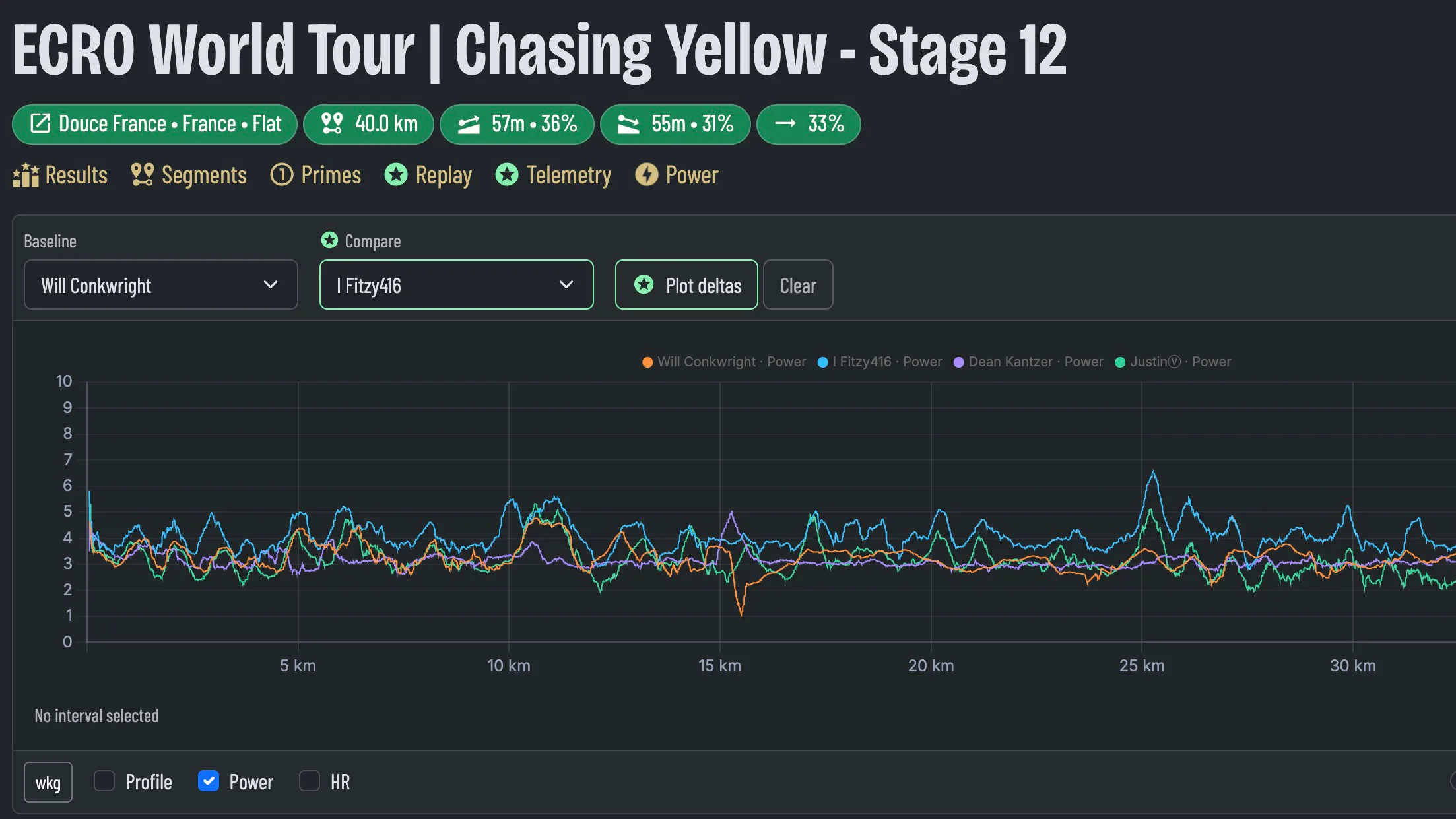
Telemetry data analysis is not as playful and interactive as the event replay page, but it is arguably the best tool for hardcore racers. If you want dead-simple, easy-to-see differences between your performance and your competitors, then this is the chart for you!
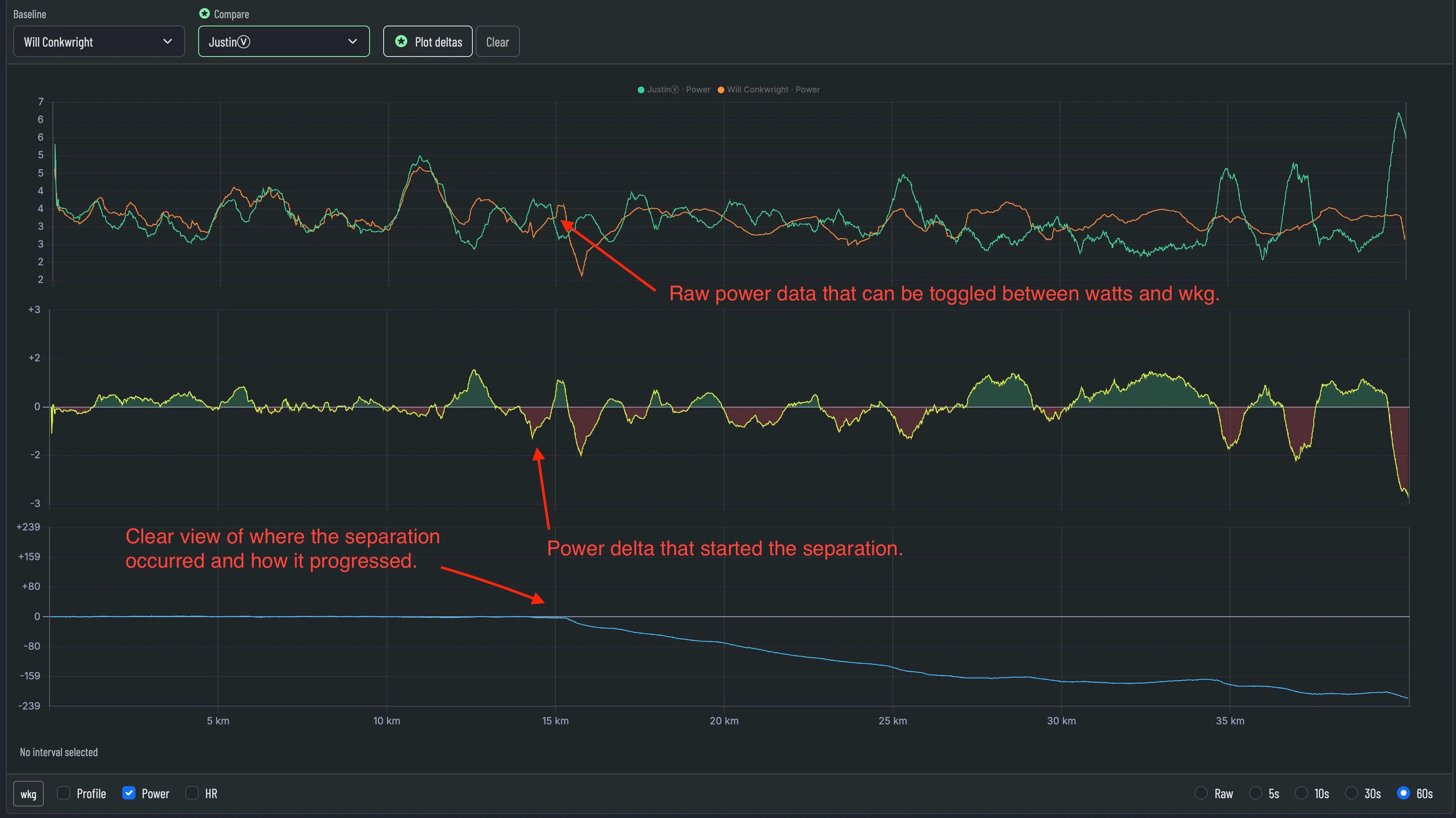
Available traces
| Trace | What it shows |
|---|---|
| Power watts | The rider’s absolute power in watts. |
| Power wkg | The rider’s absolute power relative to body weight. |
| Heart rate | The rider’s cardiovascular response to the effort. |
| Profile | The event’s virtual GPS data showing distance and elevation. |
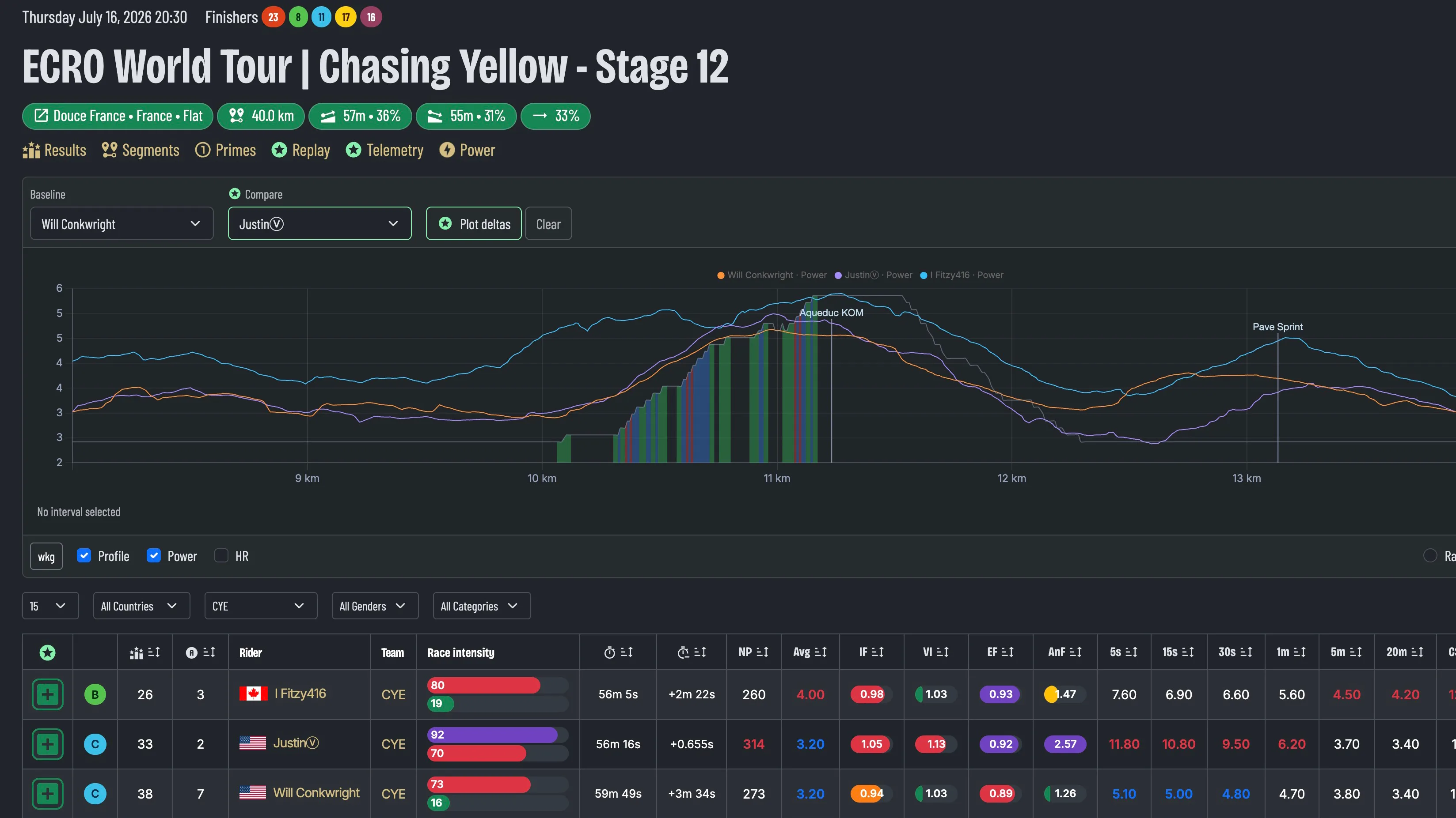
Race intensity
The race intensity gauge summarizes how hard the event was relative to the rider’s functional threshold power. It describes the overall intensity of the event rather than its competitive outcome.
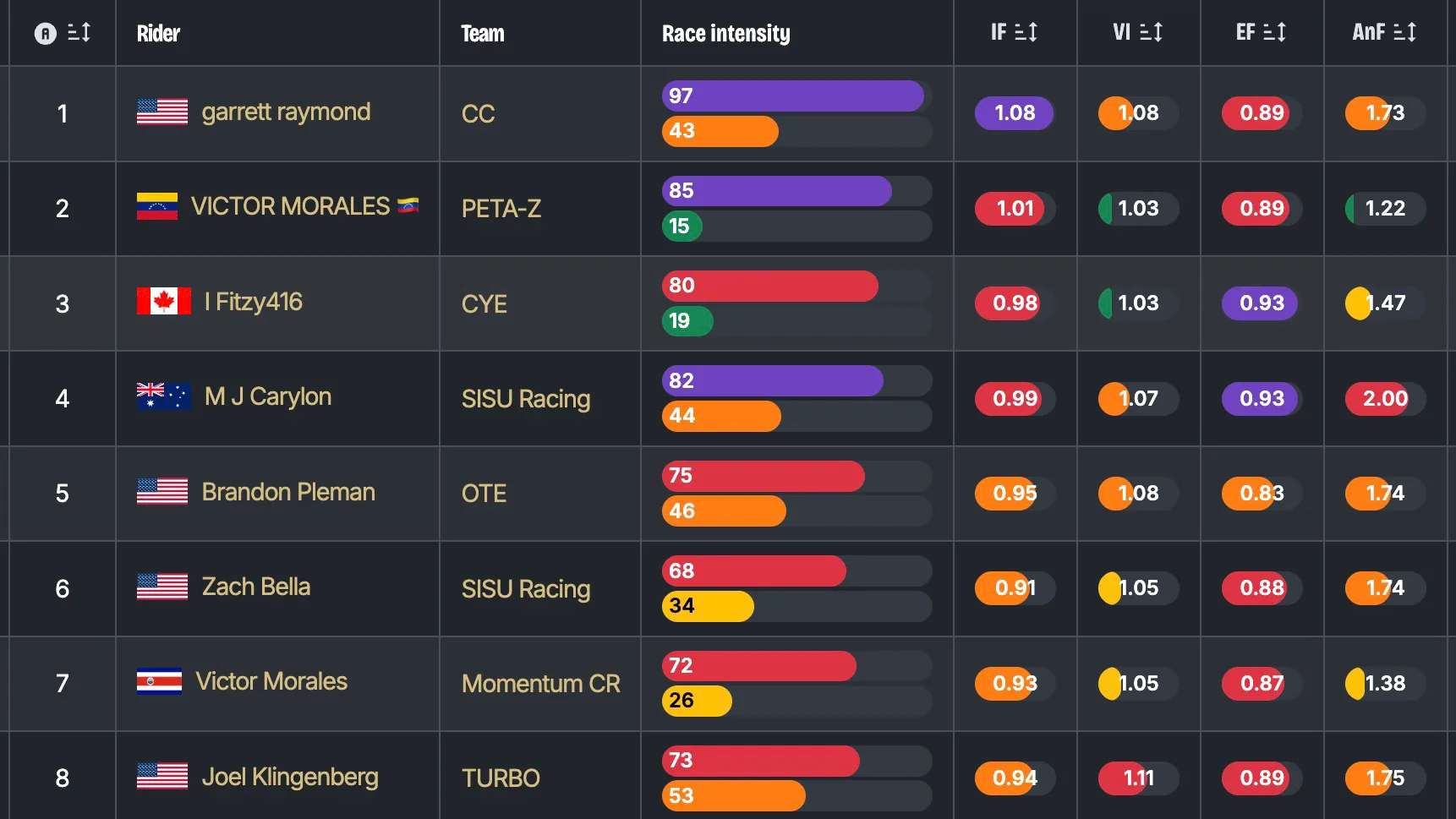
How it works
Intensity is based on normalized power relative to the rider’s FTP. Normalized power gives greater weight to harder efforts and repeated surges than a simple average-power value.
Intensity factor = normalized power ÷ FTP
The gauge converts that relationship into a simplified score and description. A higher value indicates that the race demanded more power relative to the rider’s established threshold.
Variability is shown separately because two races can have similar overall intensity while delivering that effort very differently. A steady event and a highly surging event may therefore receive similar intensity values but different variability descriptions.
Related intensity metrics
The additional columns provide more detail about how the rider produced and sustained their power during the event.
| Metric | Calculation | What it shows |
|---|---|---|
| Intensity Factor (IF) | Normalized power ÷ FTP | Compares normalized power with the rider’s FTP. A value of 1.00 represents an event intensity equal to FTP; higher values indicate a harder overall effort relative to threshold. |
| Variability Index (VI) | Normalized power ÷ average power | Describes how evenly power was delivered. Values near 1.00 indicate steady power, while higher values indicate more variation and larger surges. |
| Endurance Factor (EF) | Best 20-minute W/kg ÷ best 5-minute W/kg | Estimates aerobic durability. Higher values indicate that the rider sustained a larger share of their five-minute power over twenty minutes. |
| Anaerobic Factor (AnF) | Best 30-second W/kg ÷ best 5-minute W/kg | Estimates short-power bias. Higher values indicate a stronger thirty-second effort relative to the rider’s sustained five-minute power. |
Race demand
Race demand estimates how demanding an event was for the rider by combining the work performed with the rider’s cardiovascular response.
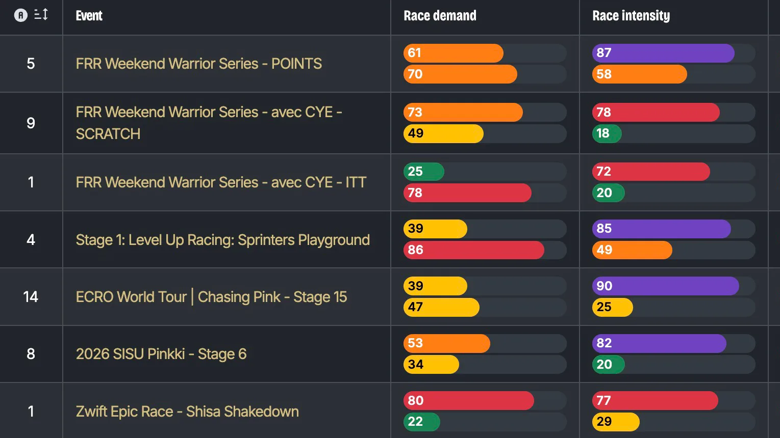
How it works
We compare the race with the rider’s own similar events. Comparable races are selected using factors such as duration and intensity so that a short criterium is not judged against a long endurance event.
| Component | Purpose |
|---|---|
| External demand | Measures power load and anaerobic demand relative to the rider’s comparable races. |
| Cardiovascular cost | Measures the rider’s heart-rate response relative to what is normally expected for a similar event. |